Understanding the project:
The High Adventure youth program and summer day camp needed a brochure for advertising. In this eight-page brochure, I was tasked with accurately representing the camp, making it visually appealing. The booklet had to target children and parents. Knowing our target audience allowed me to design these pages correctly. The information had to be clear and put in a way that would draw the audience in.
Process:
For my process, I began with gathering my information. A designer must understand all the facts going into a project, and how to express them. Next, I figured out what information I would want on each page. I laid out the pages to give myself a basis before going in with my design elements.
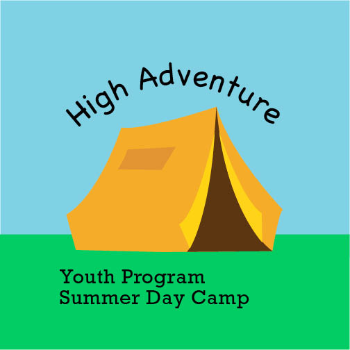
Next, I did my color study, deciding what colors would best represent the summer camp. I eventually decided on using bright, playful colors that would pop out to viewers. Giving off the feeling of a camp for children—using bright orange, yellow, blue, green, etc. The colors I decided on were kept in mind when going into the process of creating graphic illustrations, that would be seen throughout the booklet. For type, I wanted a simple font for body paragraphs and a more engaging, playful font for the cover title. So, I went with Avenir for most of the text throughout the booklet. Then I went with Chalkboard for my heading; even though that is not a standard font, I believe it works for the title, then the subhead is Rockwell.
For my compositions, I created three that I believed were each strong in their own ways. I had my peers critique them and help me come to a decision. After this, I broke down what needed to be changed in my best composition.
Ensuring my illustrations’ placements worked well with the type while not overwhelming the page took some tweaking. Also, guaranteeing enough white space was a significant factor that I had to focus on.
Solution:
The outcome of the camp brochure was eight pages filled with design-focused information. The booklet highlights the aspects of summer camp that are geared towards children. Parents and children could flip through this brochure and get a complete understanding of what the camp has to offer.
Takeaways:
I learned during this project how to gear my process towards the target group for the task at hand. For this brochure, the goal was to grab the attention of parents and children, so I had to go about my process and design to fit this goal. Throughout this task, I widened my marketing knowledge because I learned how to digest a purpose, while understanding whose attention I want to receive through my design. Putting that towards my work, allowed me to grow. I better understood the creation process when marketing for a specific group, and the outcome was an excellent fit for the project overall.
