Understanding the project:
As a designer, I need to be established in an authentic way, that expresses myself effectively. So, when going into this, I needed to be clear about how I wanted to be perceived by future employers, peers, etc. I went through the design process, step by step, to perfect the branding which suited me best. The design here represents who I am, not just as a designer but as a person.
Process:
Going into this process, I first did a deep search online, viewing other designers’ branding, looking at aspects such as their color palette, type, or detailed elements like how they placed certain things, etc. Inspiration was a huge part of beginning this process, because I wanted to do something that stood out from others. I wanted my logo to be engaging because my name needed to be a standing-out point.
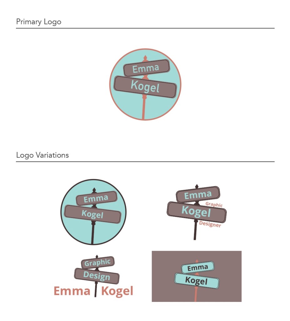
Next, I went into sketching, just getting down my thoughts and ideas and seeing what worked and what didn’t. I learned through sketching that my initials EK did not work in a logo like some initials do. It just didn’t look professional and pleasing to the eye. So, I messed around with just my name and got a few good ideas out of this, utilizing shapes and different types. Pinterest was a great place for me to get some inspiration as well. I saw how people were using interesting aspects in designs. One that caught my eye was street signs. It would be eye-catching and exciting looking. From here, I utilized the street sign and decided if I wanted to put it in a shape, and if so, what shape? Through trial and error, I created the street sign with my first and last name, all in a circle. Having my peers view my ideas gave me helpful feedback that sent me in the right direction.
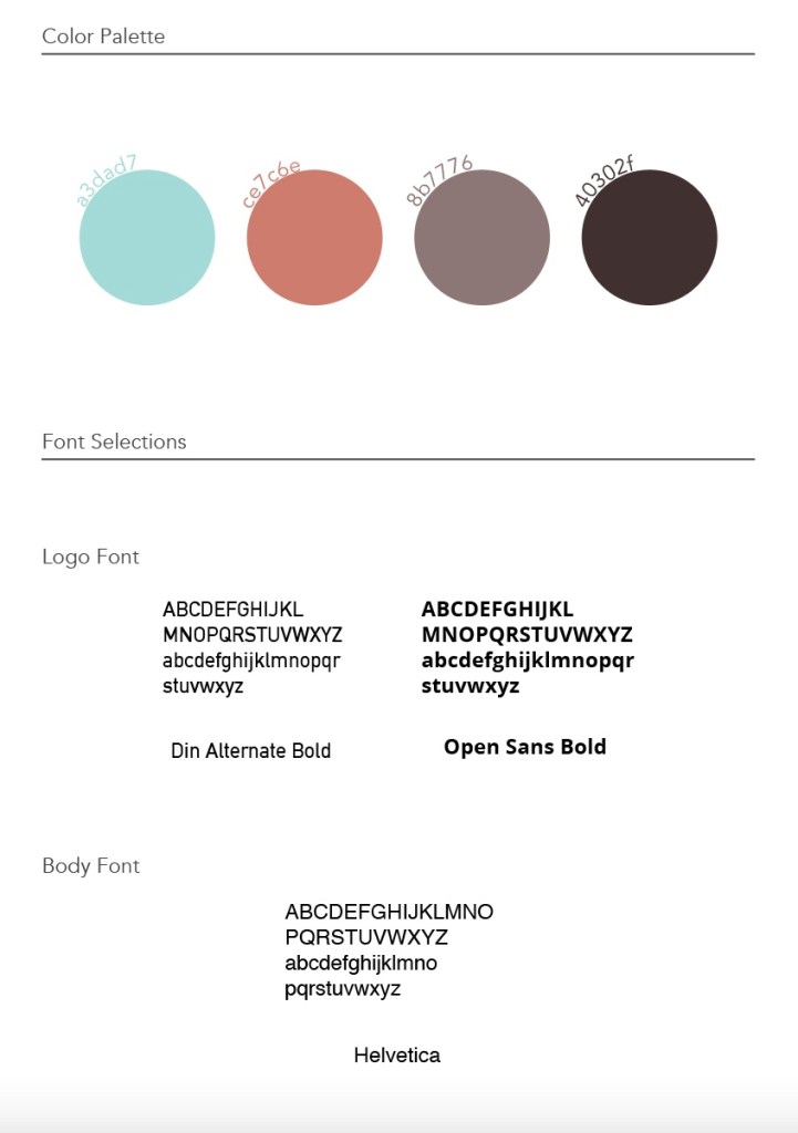
Now, color and type were decisions that took me more trial and error than I desired. I saw people using many general blues in their branding, and that was something I wanted to stray away from. I tried to find one color I would use as my base to get an idea of what color palette would suit me best and help me stand out. Orange was a color that I didn’t see people play within their self-branding often, so that would be an excellent place to start. I didn’t want a harsh bright orange but more of a pastel. I compared different oranges until I got the one that worked best. Then I had to figure out the rest of the palette that went with that orange. I eventually decided on a teal, light brown, and darker brown.
Now that the color palette was decided on, I went into my font selection. I knew a few different fonts would be suitable for this design. I wanted it to be readable, not too thick, or thin. I typically enjoy San-serif fonts because they’re usually legible, and there are so many that would be great for words you want to be seen and remembered. Open Sans Bold is a perfect font for my primary logo. It works for my name and helps me stand out. And, of course, it is readable, the most crucial factor in the text on a logo. Din Alternate Bold is another main option for my logo variations, and then, for my body text, I chose Helvetica. Helvetica is always my go-to because it is readable and has a simple font that usually works.
Lastly, my mood board was also a factor that helped shape exactly what my brand would look like. This is because the colors I used could be repeated easily and establish my brand better, being seen through my logo variations.

Solution:
The outcome of my brand was well thought out and went through many critiques and changes to become what it is now. My branding can be seen throughout all my work as I use aspects to establish myself as a designer. The process led me to the results that reflected the same design elements.
Takeaways:
Going through the self-branding process allowed me to better understand myself as a designer and what design elements are most important to me. Learning the difference in branding for others as opposed to myself was very interesting. I had to dive deeply into what would make me stand out and will make my uniqueness shine through. Overall, the process took time but was worth it to establish a pattern amongst my work, branding is definitely essential for every designer to go through critically.
