Understanding the project:
I had to create a typography booklet, so I chose Helvetica due to it being a font that works well and is very widely used. I enjoy it in big bodies of type but also in headers. It works in different sizes and, overall, is a classic font. So, understanding the effectiveness of Helvetica first is extremely important, but then figuring out a way to make an eight-page booklet attractive to the viewer’s eyes was the obstacle. The main objective was to design this booklet to highlight the typography without doing too much so that the viewer could digest it. It’s supposed to feature the font to the point that engages and fascinates the audience.
Process:
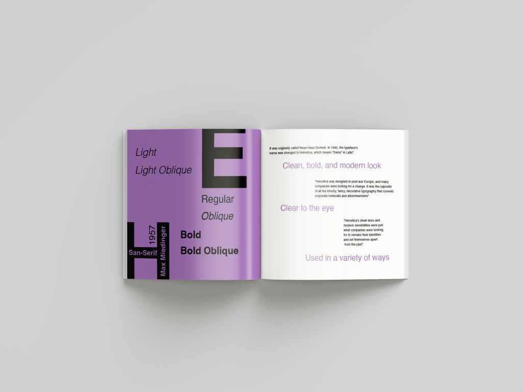
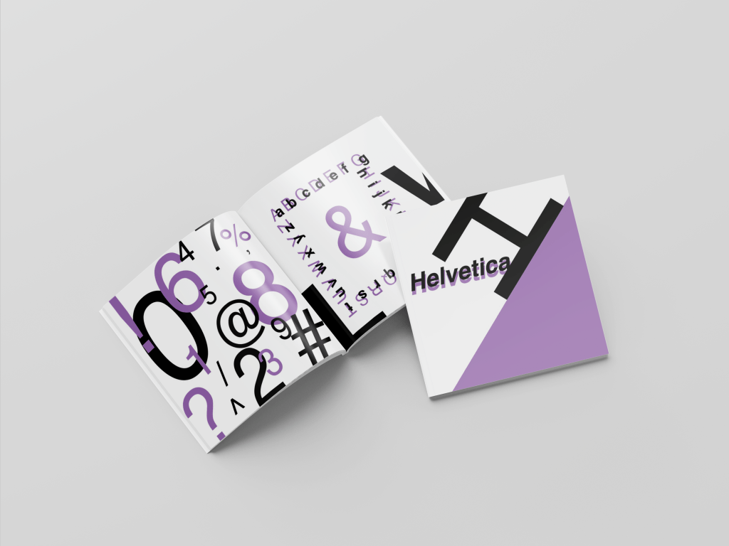
First, I researched Helvetica and the history behind it. I needed to include this in my booklet so the viewer would understand where and how the font came to be. So, from gathering my research on the history, I had to grasp the knowledge of how it looks in different letters and numbers. Doing this helped to design around the uniqueness and beauty it holds.
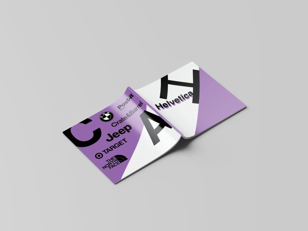
Next, I went into figuring out my color scheme. I wanted the pages to have white space and a color that would not be overpowering. The primary color of this color palette had to be pleasing to the eyes so the audience could focus on the font and how the design highlights it. I decided on a darker purple that was still light enough, so the booklet was not too gloomy. Then I put that purple with white and black, simple enough not to be distracting.
I wanted the pages to be bold and almost have the design pop out at you. This is because the topic isn’t very delightful on its own, so the design must carry it in an eye-catching way. Regarding an eight-page booklet on Helvetica, there are more exciting topics in the world. So, the design had to pop out at the viewer. I focused on taking up space and leaving enough room to avoid an overwhelming design. White space was still significant to me due to that being something as designers we must keep in mind, especially with a booklet like this one with many pages. I spread my information and knowledge on all these pages, giving me enough room to show uniqueness through my design and not just slapping the fonts on there.
I sketched different ideas, and then from that point, I created three different compositions. I took these three compositions and had my peers critique them. Having detailed feedback gave me a place to work from. I chose the best composition between my thoughts and peers, then broke that down to improve it. I went from page to page with the feedback and my design knowledge changing aspects that worked. A big issue I initially had was the text needing to be more precise, and I went too far with trying to make it look unique that the text became unreadable. So, I worked heavily on that issue to make it readable but also fun to look at.
Solution:
The outcome of the Helvetica booklet solved the issue of establishing an eight-page typography booklet while making it pleasing to the eye. I produced a design that can be viewed page by page in an exciting way that keeps the audience engaged. The result satisfied the solution to the problem. with a booklet that brings uniqueness. And shows the font off in a way that uses design elements and factors that establish a functional design.

Takeaways:
Taking on a project based on a specific topic that might interest a few people and transforming it in a well-designed way was a challenging task. I had to go through many different critiques and steps to get the booklet to where I was satisfied with the outcome. I learned how with any project, there is a way to express your uniqueness as a designer, even if the topic is straightforward.
